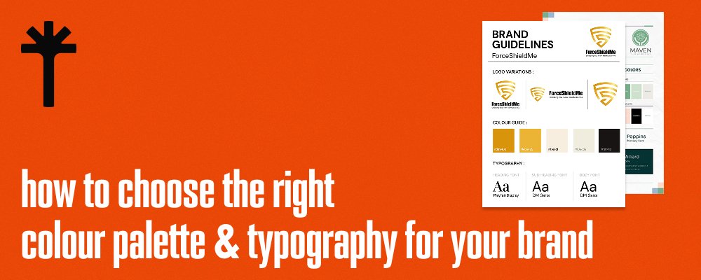
When it comes to building a memorable brand, your visuals often speak long before your words do. The colours you choose and the typography you use are more than just design decisions; they are strategic tools that shape perception, influence behavior and define how your audience experiences your identity. Whether you are refreshing an existing brand or creating one from scratch, choosing the right visual elements is one of the most important steps in shaping long term recognition.
A successful brand design is not only about looking aesthetically pleasing it is about communicating the right message clearly and consistently. Every shade, font and spacing choice contributes to the story your business tells. This is why companies that invest in thoughtful, intentional design often carry a stronger presence and higher recall value than those that treat brand visuals as an afterthought.
Understanding Why Colour Matters
Colour psychology plays a powerful role in shaping how people perceive your brand. Studies consistently show that colours influence emotions, trust and even buying behavior. Blue communicates reliability, green signals growth, orange feels energetic and red evokes urgency or passion. The key is selecting colours that reflect your brand personality rather than what simply looks trendy.
To choose a palette that works, begin by understanding the message you want to communicate. Are you a calm and professional service provider Are you a fun, youthful brand Do you want to feel premium or approachable Your colour palette must align with this identity. A mismatch creates confusion and weakens brand consistency.
Equally important is creating balance within the palette. Most strong brands use a combination of
• one primary colour
• two to three secondary colours
• one accent colour for contrast
This structure ensures your brand feels cohesive without overwhelming the audience.
Choosing Typography That Reflects Your Identity
Typography is another core element that heavily influences brand perception. Fonts shape tone. A modern sans serif feels clean and innovative, while a serif font feels classic and credible. Script fonts add personality but must be used carefully to avoid legibility issues.
When selecting typography, ensure that your primary font reflects your personality and remains readable across all devices and sizes. Supporting fonts must complement rather than compete with the primary typeface. A good rule is pairing one serif with one sans serif for harmony and contrast.
In addition to style, consider spacing, weight variations and hierarchy. These details help organise information, guide the viewer’s eye and create a visual rhythm that feels professional and intentional.
Building a Cohesive System
Both colour and typography must work together as a system. A brand is rarely remembered for one element alone, it is the combination that creates emotional impact. A warm colour palette paired with a cold, rigid font creates a disconnect. In contrast, a minimalist palette with structured typography creates a modern, high end feel.
Your visual system should also remain flexible enough to work across mediums. A colour that looks perfect on screen may appear dull in print. A font that feels sharp on desktop may feel cramped on mobile. Testing your choices in multiple formats ensures consistency across platforms.
Why Professional Guidance Matters
With the landscape becoming increasingly competitive, businesses are turning to the best branding services to ensure every design decision aligns with strategy. Even small mistakes such as poor colour contrast, hard to read fonts or inconsistent spacing can reduce trust and weaken your online presence. Professional designers bring a deeper understanding of psychology, visual hierarchy and how users interpret design across channels.
At this stage, it becomes essential to highlight the role of Arbortising. As a full service creative and marketing agency, arbortising approaches branding with strategy, user behaviour and long term identity building at the forefront. Their team focuses on crafting visual systems that feel unique, modern and aligned with real business goals rather than relying on generic templates. Whether you need refinement or complete brand creation, their approach ensures lasting consistency and recognisable identity.
Making Data Driven Choices
Modern branding is no longer driven by intuition alone. Today’s approach combines creativity with analytics. Designers use audience research, industry trends and behavioural insights to create visuals that resonate with the right groups. A youthful audience reacts differently to colour and font styles compared to a corporate or luxury audience. Understanding this allows brands to create visual identities that perform, not just look good.
Bringing Colour and Typography Together
Your colour palette and typography must support each other both visually and emotionally. Here is a simple approach to merging them effectively
• Start with your brand personality keywords
• Pick colours that reflect those traits
• Select fonts that match your chosen emotional tone
• Test combinations across social media, website and print
• Ensure accessibility contrast ratios remain strong
• Create a style guide for future consistency
When this is executed well, your brand becomes instantly recognisable regardless of where your audience sees it.
Conclusion and Call to Action
Choosing the right colour palette and typography is not just a design choice it is a foundational branding decision that influences trust, recall and long term impact. Thoughtful visual identity helps your audience understand who you are before they read a single word. For businesses seeking guidance, partnering with experts who specialise in branding marketing services ensures your brand communicates with clarity, confidence and creativity. Visual identity is an investment and when done well, it becomes one of your strongest competitive advantages.
If you want your brand to stand out with a strategic, modern and visually powerful identity, Arbortising can help you build a system that lasts. Explore how we elevate brands through design at https://arbortising.com


